Measures of spread or variation
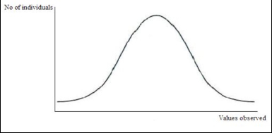
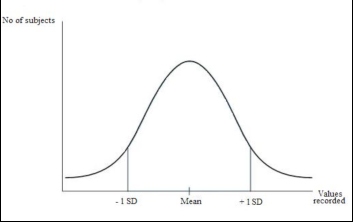
Measures of spread give information regarding how data are distributed around a point (e.g. the mean or the median). Using these measures we can add information to what we learnt from measures of central tendency for example, we can see not only the most common value but also where the range of values lie and how often less common values occur and so on. Normal distribution The concept of normal distribution is important because it is on this that measures of spread are based. It also allows us to know if the data we sampled is from a population that deviates from a normal distribution or that we have not sampled enough individuals within a normal population to illustrate that the sub-population is also normally distributed. If the sample is large enough and the population from which the sample is taken from is normal, continuous data should have a normal distribution. A normal distribution is illustrated as a bell shaped curve where the largest area under the graph corresponds to the central value (i.e. most subjects will have scored that value), while extreme values (the low and the high ends) will be less common (Clarke, 1994; Harris and Taylor, 2003).
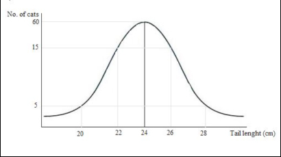
A bell shaped curve, which represents the normal distribution of a population. Example. Imagine that you measure the length of the tails of a big group of domestic short haired cats (e.g. 100 individuals). You find that most of them have a tail length of 24 cm (in a normally distributed population mean, mode and median are the same). Fewer cats have a longer tail (e.g. 26 cm) or a shorter tail (e.g. 22 cm) and just few of them have an extremely long (e.g. 28 cm) or extremely short tail (20 cm).
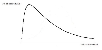
Graphic representation of the population of cats observed. Note the bell shaped curve which represents the distribution of the population around the mean value (i.e. most of subjects are represented by the mean value, fewer are represented by more distant values). Task: Take a continuous measure (e.g. weight, height, tail length) of a number of individuals from a species of your choice and plot the measures. How closely does your graph represent that of a normal distribution? Is there any skew? If so, what direction? And why might this be? Skewness However, series of data not always produce a “bell shape” normal curve. In some cases the lower range of values is collected from a higher number of subjects, in other cases most individuals correspond to the higher range of values. This asymmetry is called “skewness”. The ending parts of the curve are called “tails” and they provide a visual representation of the skewness of the distribution. When the right tail is longer than the left one it is said that the distribution is right-skewed or skewed to the right.
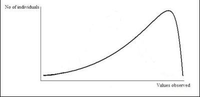
Graphic representation of a right-skewed distribution. It is visually evident that most of individuals are in the lowest range of the valued observed. When the left tail is longer than the right one it is said that the distribution is left-skewed or skewed to the left.
Graphic representation of a left-skewed distribution. It is visually evident that most of individuals are in the highest range of the valued observed. Range This is the most basic way of expressing the spread of values in a sample and is simply the difference between maximum and minimum values (i.e. the lowest and highest value of the set of data), (Howkins, 2005). Example. The amount of time that a herd of 10 horses spend grazing per day has been measured for each individual. The following data have been collected.
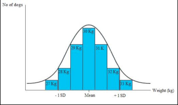
The range is 11 (max. value) minus 8.5 (min. value) = 2.5. Task. Using the data in the example given for median (hours cat spends sleeping each day), calculate the range. Quartiles A quartile is simply the value of the data point that lies a quarter of the way into a data set and it is commonly used to describe the spread of a nonparametric distribution (Dytham, 2000). To calculate the quartiles it is necessary to first calculate the median of the set of data; then the lower quartile corresponds to the middle value of the lower half of data set, while the upper quartile corresponds to the middle value of the upper half. As for the median, if half of the data set is formed by an even number of values, then the quartile is equal to the mean of the middle pair of values. Since they correspond to the number of data divided by four, quartiles are also known as the 25th percentile (the lower quartile) and the 75th percentile (the upper quartile). Inter-quartile range: This is the difference between the lower and the upper quartile (75th minus 25th). If it is illustrated on a graph, the inter-quartile range allows a visual comparison of different populations to be made very easily (see Box and Whisker plot). Standard deviation The standard deviation is used with normally distributed data, and describes how much each datum point differs from the mean (Howitt and Cramer, 2007). The following applies when values are plotted: 68.2% of the subjects of the population studies are included in the range between 1 standard deviation above the mean to one standard deviation below the mean (also said the mean ± 1 standard deviation); 95.5% of subjects fall into the range of ± 2 standard deviations of the mean. 99.7% of subjects fall into the range between the mean ± 3 standard deviations (Harris and Taylor, 2003). The standard deviation for a sample can be calculated by dividing by the number of scores collected: s = S(xi – x)2 xi =Observed value; x = Mean; N=Number of observations N However, to use a sample to estimate the standard deviation of the population, we have to use the number of date points we collected minus 1 (Field, 2010). s = S(xi – x)2 xi =Observed value; x = Mean; N=Number of observations N-1 Graphic representation of a normal curve. ± 1 standard deviations are indicated. Example. The weight of a group of dogs of a certain breed has been measured and the mean value is 30kg. The standard deviation for these measurements has been calculated and it is 2kg. This means that 68.2% of the dogs in the population considered weigh 30 ± 2 Kg (i.e. their weight is a value between 28 and 32kg). However, a small number of dogs will be outside this range: 95.5% of the dogs weight 30 ± 4 Kg (2 standard deviations), whilst 99.7% of the dogs weight 30 ± 6 Kg (3 standard deviations).
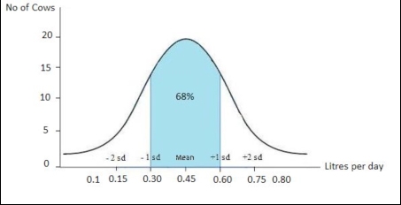
Graphic representation of the distribution of the data collected in the example On the x-axis the Mean and 1 standard deviation are indicated. Confidence interval The confidence interval is a more realistic way of presenting the outcomes of a statistical analysis than, for example the mean or the standard deviation would be (Howitt and Cramer, 2007). This is because the confidence interval indicates the range that is likely to contain the true population value, i.e. the mean value that we would get if we had data from a whole population rather than just a sample (e.g. a whole population may be all cats that are in London, rather than a sample of them). Therefore, confidence interval gives a range (interval) in which we can be fairly sure (confident) that the “true value” (the value of the true population) lies (Harris and Taylor, 2003). Example: imagine that you measure the amount of milk that each individual produces in a dairy farm of 144 animals. The mean quantity of milk, produced daily by each animal, is 0.45 litres (s.d. = 0.15) but this does not mean that every animal produced 0.45l of milk because some may be better producers than others. By drawing a graph and using the standard deviation you can predict more precisely how much milk every cow produces.
From the graph above you can see that the 68% of the animals in this farm produce a quantity of milk which correspond to the mean (0.45 l) ± 1 standard deviation. In other words, picking up any cow of the farm, we can be 68% sure that it produces between 0.30 and 0.60 l of milk.
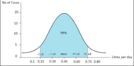
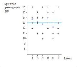
From the graph above you can see that the 99% of the animals in this farm produce a quantity of milk which correspond to the mean (0.45 l) ± 2 standard deviations. In other words, picking up any cow of the farm, we can be 99% sure that it produces between 0.15 and 0.75 l of milk. Example. Consider a sub-group of female cats living in a breeder’s house in Lincolnshire and the number of kittens that they have in a litter. On average, the results show that they give birth to 3 kittens per litter. However, if we record the data from all the female cats in Lincolnshire, the average number of kittens born within a litter may be different (e.g. 4 kittens). The confidence interval therefore gives the range in which the true value (i.e. the number of kittens per litter in the whole population, in this case, the whole of Lincolnshire) is likely to be. If the 95% confidence interval is 2 to 5 kittens, this means that we can be 95% confident that the true number of kittens born within a litter in Lincolnshire is between 2 and 5. Standard deviation vs. confidence interval The standard deviation provides information about the variability (spread) in a sample, while the confidence interval provides information regarding the range in which the true value is likely to lie (Harris and Taylor, 2003). Standard error Conceptually, the standard error is the average amount by which the mean of a sample differs from the mean of the population from which the sample is taken (Howitt and Cramer, 2007). The word “error” is used to describe an assessment of the difference between the estimate (derived from the sample) and the true value (which would be known if every individual in the population could be measured). The standard error gives a measure of the uncertainty of that assessment (Connor and Morrel, 1972) and is sometimes also referred to as the standard error of the mean and thus abbreviations may be seen as ‘S.E.’ or ‘S.E.M’. The larger the sample size, the smaller the standard error as the more likely it is that the sample and the population are the same. Example. Imagine that you are observing a number of litters with 4 puppies each and recording the age of puppies when they open their eyes for the first time. You graphically illustrate your data recorded and can therefore calculate the mean age of opening eyes for each litter separately (known as sample means). You also incorporate into the graph the mean age when opening eyes of the entire studied population (in other words all the puppies you have measured regardless of litter, which gives you the true mean for this sample). The standard error is the standard deviation of the sample mean (the mean taken for a particular litter) from the real mean (the mean of all the litters together) and about 2/3 of the sample means (68.2%) would be within one standard error of the real mean.
The graph represents the age at which 6 litters of 4 puppies each open their eyes. Each cross represents a puppy and the lilac spots are the means for each sample group (sample means, i.e. mean of each litter) – 13.75 days, 13.25 days, 12.75 days, 14 days, 12.25 days and 13 days respectively. The thick blue line is the real mean derived from all the puppies measured regardless of litter (13 days) and the thin blue lines are the standard error of the means (+/-0,64). About 68.2% of the sample means are within 1 error standard of the real mean (i.e. the mean of all the litters). |
|||||||||||||||||||||||

Compiled by:
Dr Sarah Ellis and Dr Helen Zulch
